


This is the National Museum of extinct insects. All kinds of extinct butterflies are collected here. Various exhibitions and events on ecology are often held here. The museum also works closely with universities and offers a variety of bonuses. Previously, the museum had no branding. Over the past 2 years, for many reasons, the attendance of the museum has sharply decreased, so it was decided to create a branding that would attract attention to the museum.
Brief
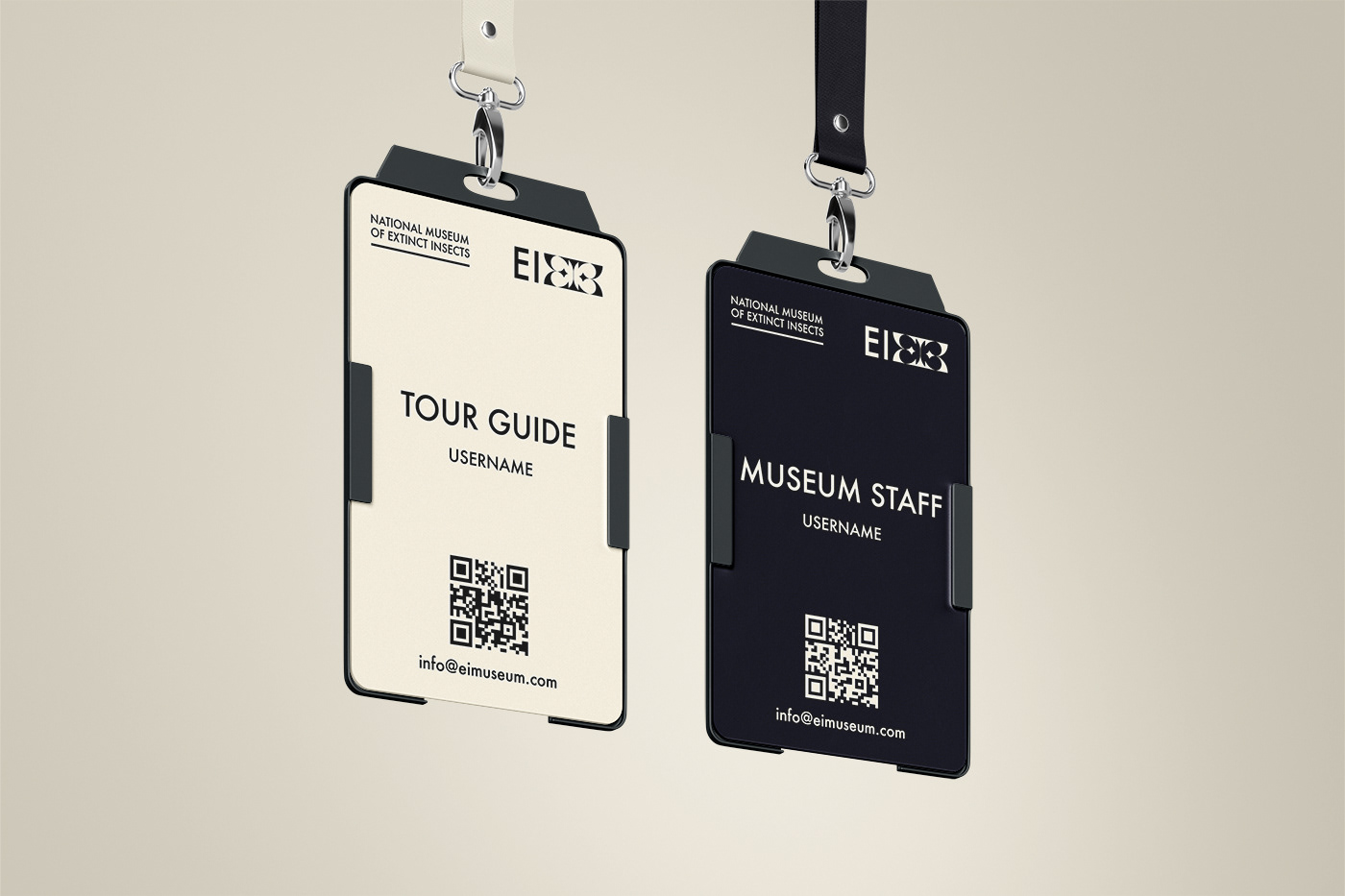
Minimalistic logo ( kind of typography ) reflecting the essence of the museum. Calm, minimalistic and restrained attention-grabbing branding.
Realization
The capital letters of the extinct insects combination were entirely created by me. Individually they are elements of visual communication, and in fusion they form a logo. When merging the letters form the shape of butterfly in the negative space, which reminds us that this is an insect museum. An example of the interaction of communication element is presented on a business card ( the word Extinct ).
Brand colors. I chose two basic contrasting colors to place different elements on them without loss of readability, and also chose two accent colors to accentuate the information. Accent colors are the colors of the everyday insect habitat - the colors of the sky and the earth (a light cloudless sky and bright, juicy greenery and trees on the ground).
Contacts
Email freucreation@yandex.by
Instagram @perezisart


